
I love ranking things. If there was a way to rank all of the “ranking” articles that have fluttered across my timeline this past offseason, I would find a way to do it. Whether it’s cereal, hip-hop albums or even NBA players, I will find a way to rank them in whatever order I believe is accurate. This time, it’s the new Nike Statement jerseys.
Nike has officially replaced Adidas as the NBA’s jersey sponsor and their new line of jerseys has not disappointed (Well, they haven’t disappointed me, at least, but I’m less critical about what people are going to sweat in for over two hours than others are). Every team has multiple jerseys to choose from with designs created exclusively by Nike. “Association” and “Icon” jerseys will take the place of what used to be known as “home” and “away.”
The latest edition, NBA “statement” jerseys, are what make up the rankings below.
Some of the jerseys may look familiar, but other teams debuted an entire overhaul of their previous jersey concepts (Looking at you, Minnesota). Honestly, I think they all look beautiful, especially the ones that were completely redone. Even the jerseys that saw minimal changes still look clean, and these will be fun to rank. My rankings are from 1-10 and I take into account whether or not a team had their jersey revamped (a new jersey = bonus points). Other than that, my rankings are based off what I believe is most aesthetically pleasing.
NBA statement jerseys, Ranked
30. Memphis Grizzlies: 4.5/10
Our Statement Edition unis will continue to showcase our Beale Street Blue. #NIKExNBA
??: https://t.co/VmG4BP29ZU pic.twitter.com/OuW8XVIgSN
— Memphis Grizzlies (@memgrizz) September 16, 2017
Not too many words from me on this one; I just simply don’t get these. They almost look like short-sleeved pajamas.
29. Los Angeles Lakers: 5.5/10
#NIKExNBA pic.twitter.com/rAQUWLrtAK
— Los Angeles Lakers (@Lakers) September 16, 2017
The white borders around “LAKERS” is a beautiful touch, but nothing else has changed from the jerseys that I’ve been watching for what feels like decades now.
28. Dallas Mavericks: 6/10
? STATEMENT X SKYLINE@jjbareapr pic.twitter.com/P26L7QsvJA
— Dallas Mavericks (@dallasmavs) September 18, 2017
I’m a big fan of skyline jerseys, but this one came off as too generic with no flair like the Nuggets’ jersey has.
27. Los Angeles Clippers: 6/10
?? Association
?? Icon
? Statement #NIKExNBA » https://t.co/2wt7OsKXxn pic.twitter.com/jjW7TXaV3W— LA Clippers (@LAClippers) September 17, 2017
The third, last, and worst of the “practice jerseys.” Like I said, I don’t mind this look, but I can’t stand that terrible logo and how it sits right on top of the numbers.
26. Miami Heat: 6/10
New ? #NIKExNBA pic.twitter.com/JytHVmLVhh
— Miami HEAT (@MiamiHEAT) September 16, 2017
These remind me of the mid-2000’s Dwayne Wade years and how he dominated in these jerseys. That’s the problem, though. Little change to a good jersey won’t put you high up in my rankings.
25. Orlando Magic: 6/10
Here's a look on how our "Statement" Jersey looks on Elfrid Payton. How do you feel about them? #BelieveInMagic?? pic.twitter.com/2NiNEY8El6
— Believe In Magic (@BelieveInMagiic) September 16, 2017
The classic pinstripe look is still here and not much else has changed, but still a clean jersey, nonetheless.
24. Detroit Pistons: 7/10
The full look.
See all the new jerseys for this season at https://t.co/kgnN6cTzg7 pic.twitter.com/GdBsuHYeKY
— Detroit Pistons (@DetroitPistons) September 16, 2017
Personally, I think the gray works best with black, like the Spurs’ new jerseys, but these are not bad. Much better than the “Motor City” alternates from before.
23. Chicago Bulls: 7/10
Looking good @denzelvalentine! #NIKExNBA pic.twitter.com/3qW4XW1gyQ
— Chicago Bulls (@chicagobulls) September 16, 2017
The white bordering is back with the Bulls’ new jerseys, which cleaned up their previous alternates that looked similar to these, except incredibly plain.
22. Houston Rockets: 7/10
? STATEMENT JERSEY. ?#NIKExNBA pic.twitter.com/bpCpkp3dkb
— Houston Rockets (@HoustonRockets) September 16, 2017
Another one with few changes, but the all-black jerseys have always been my personal favorites for the Rockets.
21. Milwaukee Bucks: 7/10
Make a STATEMENT. #FearTheDeer
More: https://t.co/a1jvJlFMHw pic.twitter.com/7gk8OaDLHl
— Milwaukee Bucks (@Bucks) September 16, 2017
Here’s an instance where the numbers above the logo works. Nike used the logo to work with the numbers and it doesn’t look out of place or like it’s trying to do too much despite the large size of the logo.
20. New Orleans Pelicans: 7/10
.@IanClark in the new #Pelicans Statement Edition Uniform! #NIKExNBA #DoItBig (via @nikebasketball) pic.twitter.com/flk6W51j7H
— New Orleans Pelicans (@PelicansNBA) September 16, 2017
These are similar to their previous alternate jerseys. Nike didn’t add white bordering to these jerseys, and I think they could have been better if they had.
19. Toronto Raptors: 7/10
Statement.#WeTheNorth | #NIKExNBA pic.twitter.com/Yamw8iCVpG
— Toronto Raptors (@Raptors) September 16, 2017
Not much new here, but I’ve always loved the letters wrapping around the numbers for the Raptors.
18. Boston Celtics: 7.5/10
The #Celtics new alternate jersey ? pic.twitter.com/ZeMiXvUW1k
— Boston Blabber (@BostonBlabber) September 16, 2017
Nike fully embraced adding white to border parts of their jerseys, taking a simple jersey and making it into a fancy one.
17. Minnesota Timberwolves: 7.5/10
The Northern Lights shine bright in Minnesota. #NewEraNewThreads
GALLERY: https://t.co/kf80sEr7gu pic.twitter.com/bXZHijLORR
— Timberwolves (@Timberwolves) September 16, 2017
Boy, that sure is a lot of neon… I think I like these jerseys, though. Doesn’t make much sense, but I bet they look awesome on the court. Maybe?
16. Portland Trail Blazers: 7.5/10
Model Moe.
? » https://t.co/aafGv3HiQn pic.twitter.com/vGJMJP9Fpu
— Trail Blazers (@trailblazers) September 16, 2017
The red background with black lettering is gorgeous and the thick, slanted stripe across the middle of the jersey has never done the Blazers wrong.
15. San Antonio Spurs: 7.5/10
Last night, @DejounteMurray joined the @NBA, fellow players and @nikebasketball to make a Statement.
? » https://t.co/AljvsQ4tzM pic.twitter.com/K3CHCwBcoe
— San Antonio Spurs (@spurs) September 16, 2017
This jersey is the most interesting to me. The gray looks fantastic, but the number being above a small logo comes off as another practice-type jersey. There isn’t anything bad about “practice jerseys” but such a unique color scheme deserves better.
14. Washington Wizards: 7.5/10
ICYMI: Clean navy returns as the Statement Edition. #NIKExNBA | https://t.co/03wev3Y36P#DCFamily pic.twitter.com/VyAL5mqaK0
— Washington Wizards (@WashWizards) September 16, 2017
These jerseys are similar to ones they’ve had in the past but, it’s such sleek looking design that these couldn’t stay out of the top 15.
13. Atlanta Hawks: 8/10
Making a Statement. #NIKExNBA pic.twitter.com/6vw3WMLZta
— Atlanta Hawks (@ATLHawks) September 16, 2017
These jerseys feel too low in the rankings, but I can’t in good faith put them ahead of the others. That being said, these jerseys look amazing. From the “ATL” on front, to the triangle pattern, to the numbers, everything about this jersey looks great.
12. Brooklyn Nets: 8/10
? B K L Y N ? pic.twitter.com/sCojDRWQ87
— Brooklyn Nets (@BrooklynNets) September 16, 2017
The best part about these jerseys is the font and how they abbreviated Brooklyn down to “BKYLN.” Nothing too fancy about these jerseys, but sometimes simplicity still looks beautiful.
11. Cleveland Cavaliers: 8/10
Our Nike Statement Edition black uniform makes its debut on November 24th vs. Charlotte.
PHOTOS ? https://t.co/Nz5dZaO1J1 pic.twitter.com/Fzd4YoH7D0— Cleveland Cavaliers (@cavs) September 16, 2017
Going with the same all black that won them their first ever NBA title, Nike did an excellent job with the Cavaliers’ new jerseys. The numbering mimics the same style as the new logo, and the background stripes are a great touch. If it wasn’t for the fact that the “C” makes these look like something they might practice in, these would be much higher on the list.
10. Indiana Pacers: 8.5/10
See more photos of the Statement uniform and pre-reserve your new Pacers jersey at https://t.co/nq0ocBgCTb pic.twitter.com/w44KInw7Fa
— Indiana Pacers (@Pacers) September 16, 2017
Nike went back to the roots of Indiana with this latest design. These jerseys are modeled after their famous “Hickory High” jerseys, which paid tribute to the 30th anniversary of the movie Hoosiers. Take a look at the color and then try to guess why I love them so much.
9. New York Knicks: 8.5/10
The Knicks #NIKExNBA jersey pic.twitter.com/Vqcod0t0XE
— LaurenNYknicks ? (@AaliyahNevaeh7) September 16, 2017
Similar to their home jerseys from last season, the Knicks’ Statement jerseys clean up the unnecessary color around the sleeves, using the background of the jersey as a border inside the letters and numbers. Taking out color and adding more white might seem plain, but these jerseys are beautiful and remind me of the Miami Heat’s “white hot” jerseys.
8. Phoenix Suns: 8.5
No words needed. ?#NIKExNBA #SunsAt50 pic.twitter.com/yHQG4qdapX
— Phoenix Suns (@Suns) September 16, 2017
The abbreviation of Phoenix to “PHX” is my favorite part about these jerseys. The little flair on the tips of the lettering is a sleek touch and the orange and black color scheme has never failed.
7. Sacramento Kings: 8.5/10
Alternative Court ??
Matching Statement Uniforms ????#NIKExNBA pic.twitter.com/G4AGH0Xsru— Sacramento Kings (@SacramentoKings) September 16, 2017
Nike finally did away with the Kings’ previously hideous alternate jersey and blessed us with clean lettering and an innovative pattern. The Kings received some bonus points for announcing their new court design, which gives off a sense of royalty. Nike and the Kings are fully embracing their team name and doing a great job at it.
6. Utah Jazz: 8.5/10
We'll wear our #JazzGold unis for the first time on 11/25 vs the @Bucks! pic.twitter.com/oPGHZiBgYV
— Utah Jazz (@utahjazz) September 16, 2017
Maybe I’m just a sucker for bright colors, but once again the gold is what made me fall in love with the Jazz’s new threads. Nike abused the brilliant logo and built it right next to the number, and my goodness do they look clean or what?
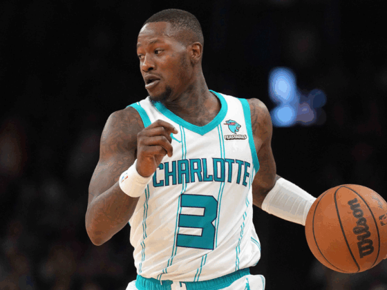
5. Charlotte Hornets: 9/10
???@KembaWalker looking goooooooooooood in that new uniform!! #NIKExNBA pic.twitter.com/WK4RCJoQyN
— Charlotte Hornets (@hornets) September 16, 2017
Perhaps the wildest color scheme of any team is the Hornets new jerseys and they are fantastic. The teal and purple are so unique and they get a bonus point for being the only team with the Jordan logo on the front.
4. Denver Nuggets: 9/10
Statement.
? | https://t.co/5FHFfLe6LZ pic.twitter.com/r68xTyfYq1
— Denver Nuggets (@nuggets) September 16, 2017
Denver has never gone wrong with their yellow jerseys. This version is slightly different than the one from previous years as they removed the stripes across the middle, making it simple, yet elegant. I wouldn’t even dream of playing as the Nuggets in NBA2K unless they were wearing these dandelion beauties. Plus, skylines on jerseys are never not fire.
(Editor’s note: Plus, these are an homage to the OG Nuggets skyline jerseys, which are absolute classics)
3. Golden State Warriors: 9.5/10
What do you think of our #NIKExNBA Statement Edition uniforms, #DubNation? ? pic.twitter.com/IlmdRCnsPB
— Golden State Warriors (@warriors) September 16, 2017
I had a difficult time choosing between the Warriors and Thunder jerseys, but ultimately I gave the no. 2 spot to the Thunder. Despite these Dubs jerseys landing at no. 3, they have the most unique design of any of the 30 jerseys. “The Town” is a reference to the city of Oakland (If you’re from the area, you know that San Francisco is the city and Oakland is the town), and the giant tree that umbrellas in the center of the jersey is an homage to Oakland’s Oaktree.
2. Oklahoma City Thunder: 9.5/10
Closer ? at the Statement. pic.twitter.com/7Hgz8C3O8y
— OKC THUNDER (@okcthunder) September 16, 2017
These Thunder jerseys are gorgeous and they are only so gorgeous because of the horizontal shift in the middle of the orange lettering. That little touch (which is possibly suppose to look like a lightning bolt?) is aesthetically pleasing to me while also completely destroying my need to make sure things are perfectly center at all times. Great color scheme and design.
1. Philadelphia 76ers: 10/10
I'm excited to play in the new Statement jersey this season. #TheProcess pic.twitter.com/0WxL8FosEd
— Joel Embiid (@JoelEmbiid) September 16, 2017
If following The Process included upgrading their jerseys, then Sam Hinkie wins once again. The Sixers received the only perfect score on this list and it’s because I’m a sucker for fancy lettering on a jersey (Have you seen the Christmas Day jerseys? Those are all perfect). Some say the lettering is a tad askew because it isn’t perfectly horizontal, but that little touch that flows over the numbers makes me want to buy a jersey for the first time in years.

