We’ve seen some pretty awesome fan made NBA inspired artwork before but this might be the best one yet. This graphic designer from St. George, Utah, Addison Foote, took it upon himself to release NBA Team Logo redesigns for all 30 NBA teams in 30 days and man, they look amazing.
With the exception of the Orlando Magic logo, all these new redesigns are almost perfect renditions of the old logos or complete remakes that some NBA teams should run with. The designs by Foote are so good that the NBA took notice and actually hired him.
Following from KSL News.
Because he works full-time, Foote was only able to spend about 3 hours on each logo. However, he was able to complete the 30 logos within his goal deadline, completing the last one on Aug. 22. He posted all the logo redesigns online where they immediately went viral on sports blogs and Reddit.
“I was shocked with how well it was received,” he said. “I didn’t have any expectations with it. I just wanted to do it just as a personal project just for fun.”
Within four days of posting the logos online, Foote was contacted by the NBA and was offered a contract to do some on-the-side freelance graphic design projects for the organization’s social media pages.
“I was so excited,” Foote said. “I’d always dreamed as a kid to do something for the NBA. I’ve always been a huge basketball fan.”
Check out Addison’s designs for all 30 NBA teams below. You can also go on his website and check out more of his work.
(Descriptions for the designs provided by Foote from his website.)
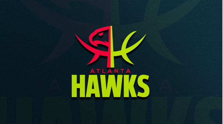
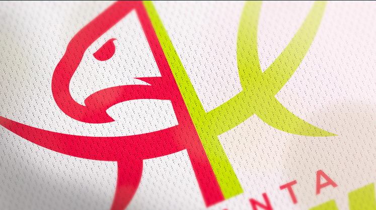
Atlanta Hawks
With this logo, I combined Atlanta’s primary and secondary marks to create the letters “AH” using the lines of a basketball and the classic Hawk.
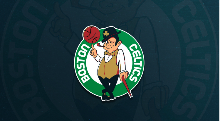
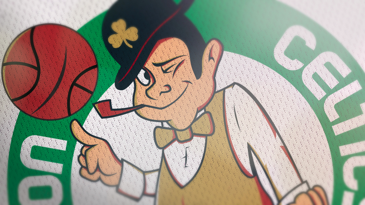
Boston Celtics
It’s hard to completely start over with a rebrand of such a classic and well-known logo like the Celtics have, so instead of trying something totally new, I stuck with all of the same key elements their current logo has and modernized it a bit.
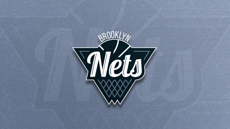
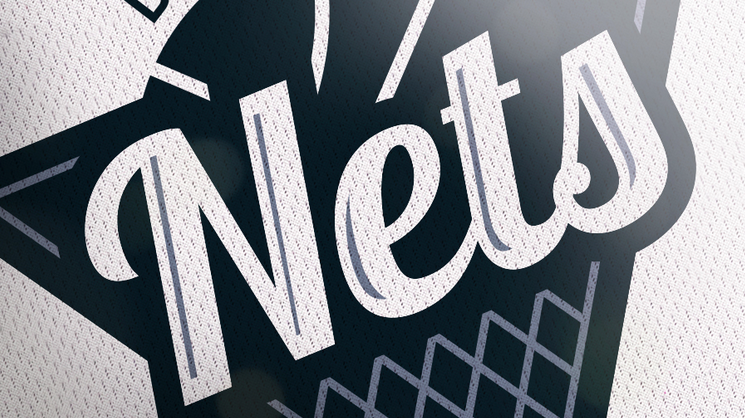
Brooklyn Nets
I drew inspiration from their current logo and their older logos from when they were in New Jersey to create this. However, I always found it strange that the franchise has had 7 different logos in their history and none of them has had a net incorporated into the design! I a put a net into my version and kept the triangular shield along with a nice flowing typeface that represents the movement the net makes when the ball goes through it.
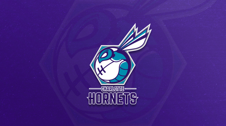
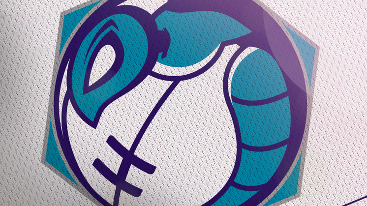
Charlotte Hornets
Since their new and older logos feature a hornet head on, I wanted to try a side-profile to be a little different. I used the lines of the basketball to create the shape of the hornet’s stinger and used elements from their current and older logos such the wings and the “H” on the ball. I bordered the logo with a hexagon to symbolize a hive.
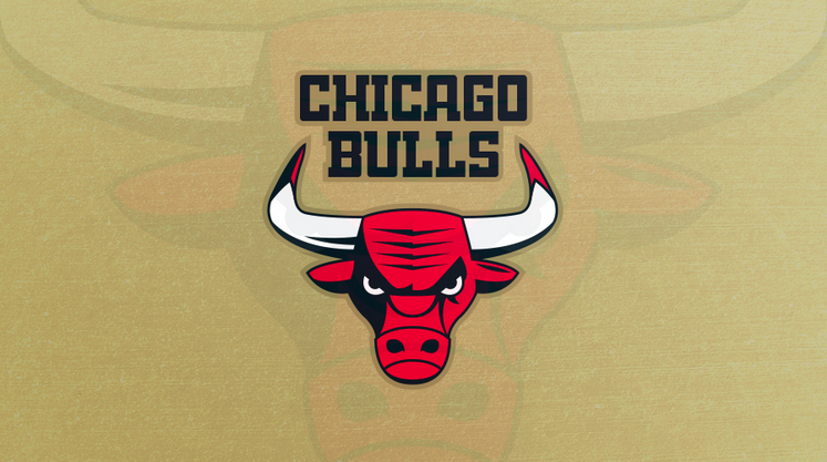
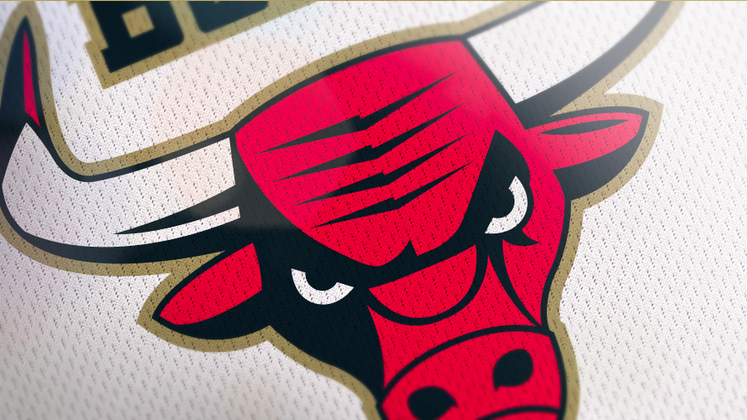
Chicago Bulls
Like the Celtics, the Bulls have one of those logos that is classic and timeless. Therefore, I wanted to keep their original logo as a base and modernize it. There is a reason the Bulls are the only team in the history of the NBA never to change or alter their original logo.
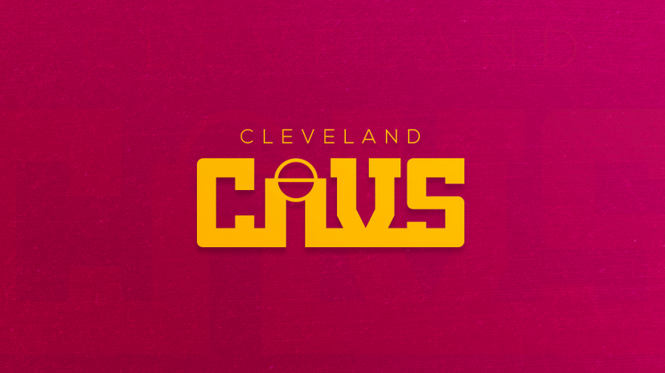
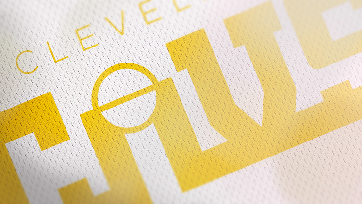
Cleveland Cavaliers
I based this logo off of the Cavs logo from 1983-1994. That logo was a simple wordmark using the “V” as a net with a ball going into it. Instead, I used the key / free-throw line to resemble the “A”.
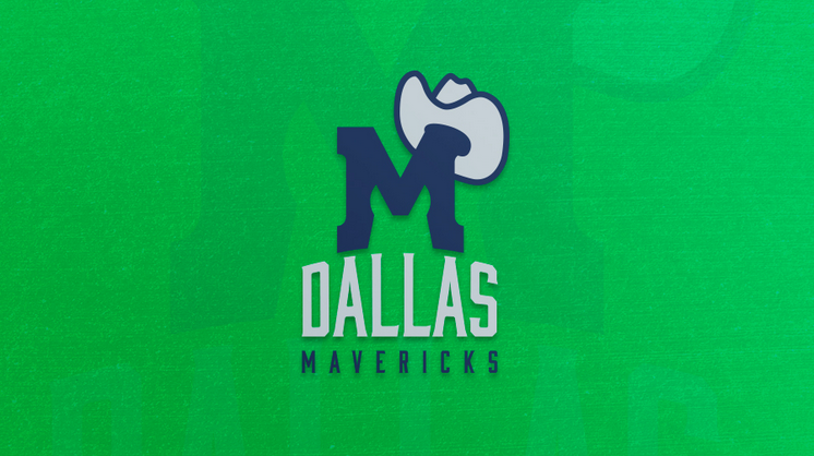
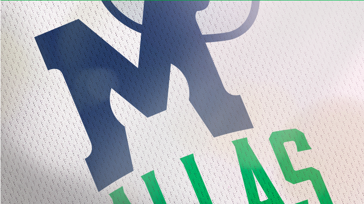
Dallas Mavericks
I used both old and new Mavs logos as inspiration for this. I based it mainly off the old logo where the “M” is wearing a cowboy hat. I updated it a bit and used negative space to showcase a horses ears and head.
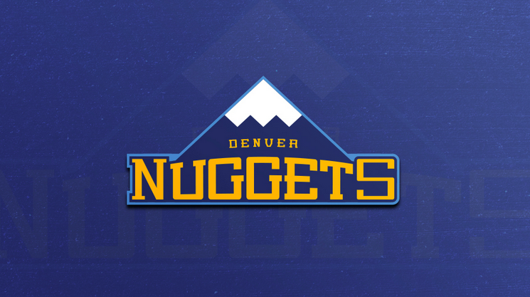
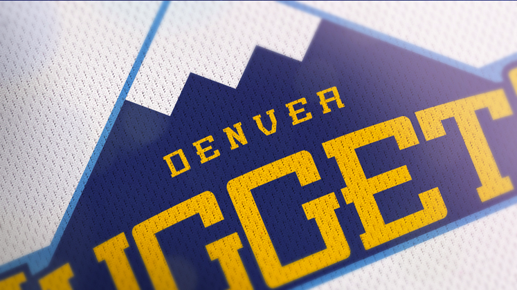
Denver Nuggets
I took a minimal approach and kept most of the same elements from Denver’s current logo to create this.
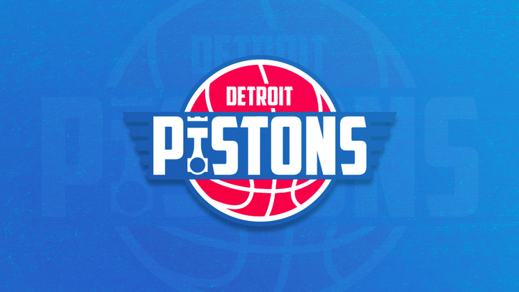
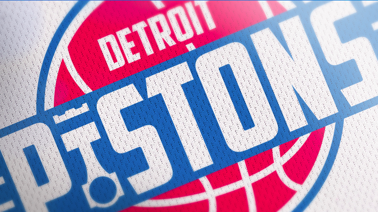
Detroit Pistons
Detroit is known as “The Motor City”. Hence the name “Pistons”. I used i piston to replace the “I” and tried to make their current logo look a little more “automotive” if that makes any sense?
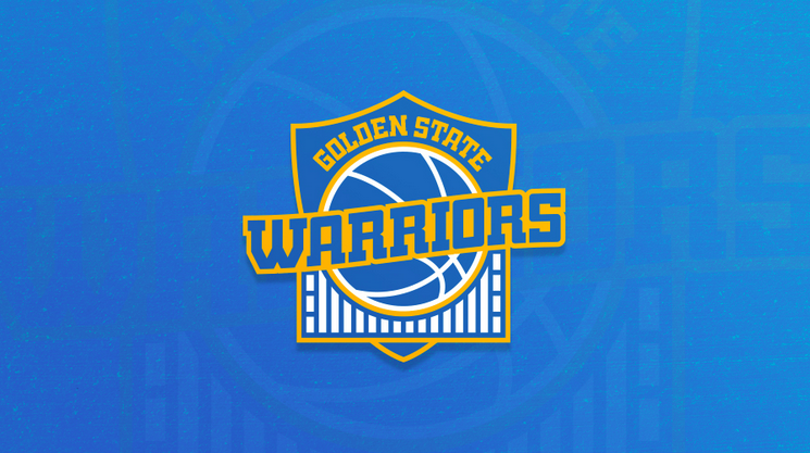
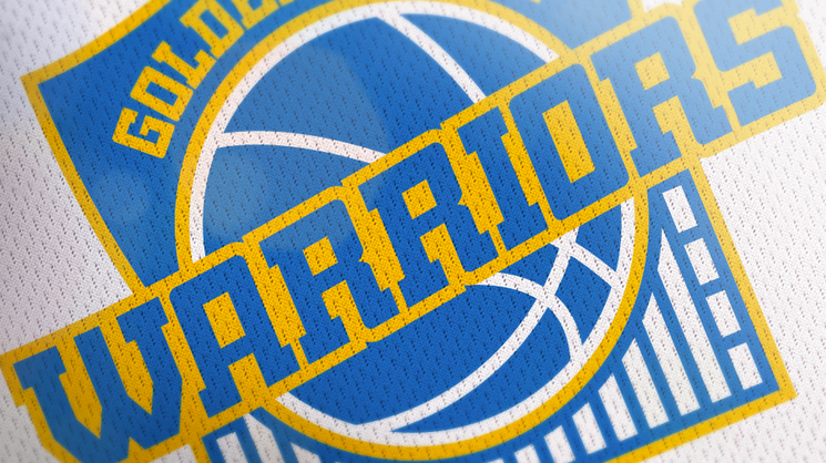
Golden State Warriors
I took every piece of the Warriors current logo, but wanted to add an element that represented a warrior, so I chose a shield which embodies strength and resilience.
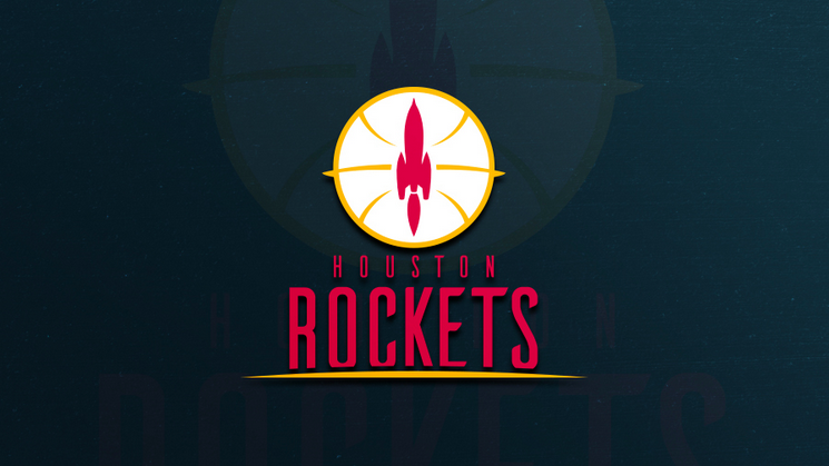
Houston Rockets
I used their older color scheme with the yellow and red and tried to make the ball look like a planet. The rocket resembles the rocket from their 90’s logo, but minimalized. The line beneath the word “Rockets” is the horizon of Earth.

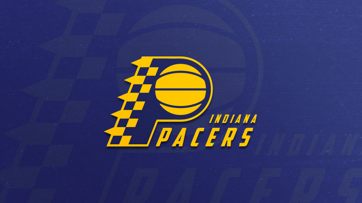
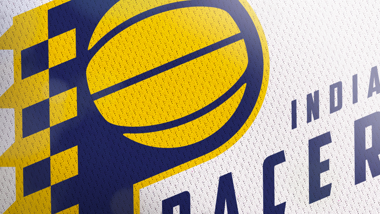
Indiana Pacers
The Pacers have stuck with this look since the late 1960’s, so I didn’t want to change it too much. I tried to add more motion to it and give more meaning to their team name, so I added a checkered pattern to the “P” to represent a the checkered flag used in racing.
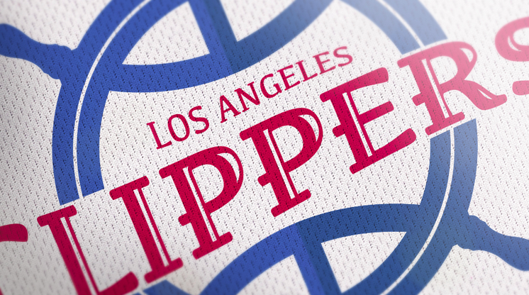
Los Angeles Clippers
The Clippers logo has always looked too similar to the Lakers logo, so I was glad they did a redesign of it. However, their new logo didn’t really give any meaning to their team name. I took a more nautical approach by mixing the helm of a clipper ship and a basketball. The helm represents direction and control. I made the type wave as if it is sailing on the sea.
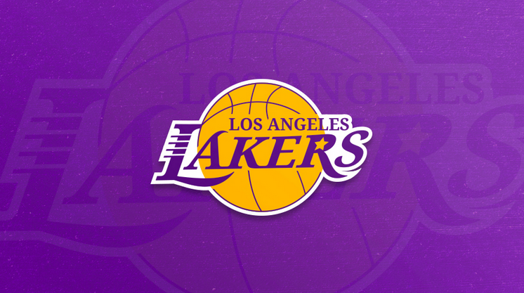
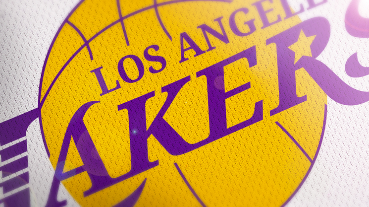
Los Angeles Lakers
Again, this is another classic logo that need not be changed too much if at all. Since the name “Lakers” originated from Minneapolis and there are no lakes in L.A., I didn’t want to bring elements from their name into the logo. Instead, I added a star inside the “R” which I think encapsulates L.A. very well.
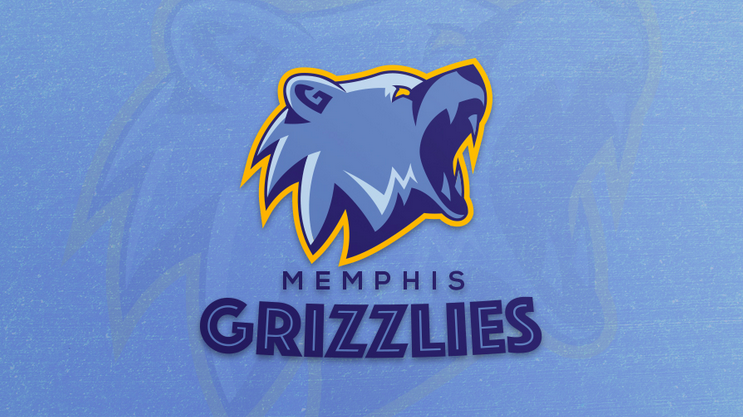
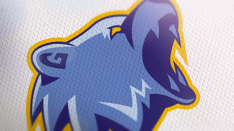
Memphis Grizzlies
The current Grizzlies logo is cool, but it kinda looks like a really mean teddy bear that you’d want to snuggle with, but wouldn’t dare try. I wanted to do something a little more fierce. I hid a “G” for Grizzlies in his ear and an “M” for Memphis to left of his mouth.
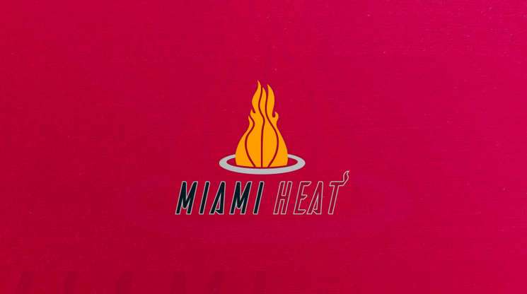
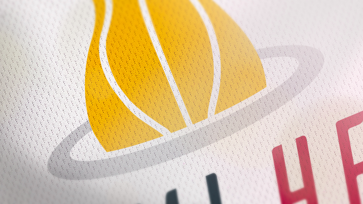
Miami Heat
The Heat have only made minor tweaks and slight color changes to their logo. I wanted to keep it the same, but change it up more than it ever has at the same time.
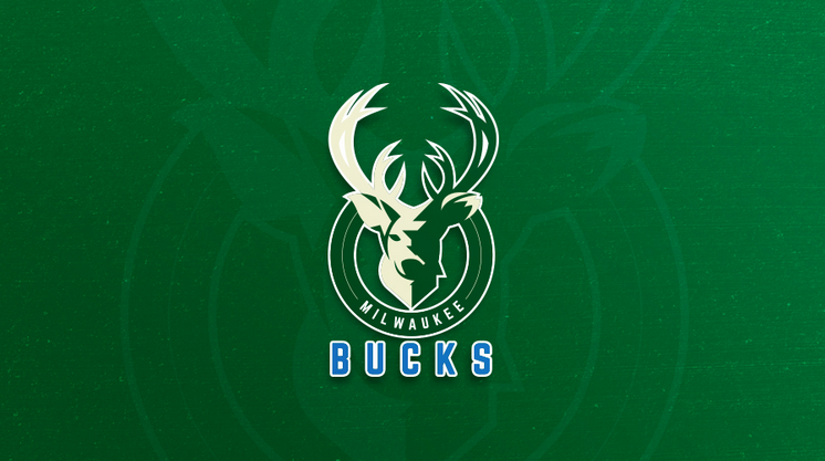
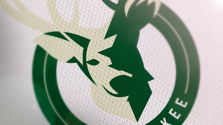
Milwaukee Bucks
I love the new Bucks color scheme. I’m not reminded of Christmas and Rudolph when I think of the Bucks anymore. Their new logo is a little cartoony which plays off their original logo very well. With mine, I wanted to try adding a little more realism.
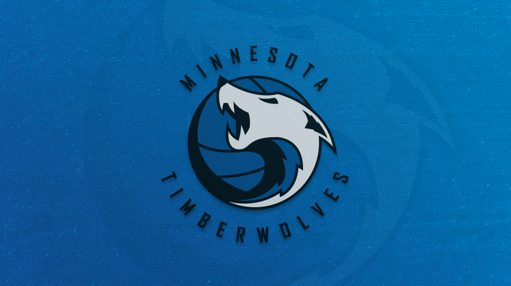
Minnesota Timberwolves
I used their “wolf howling in the basketball” mark as inspiration for this. Rather than howling, I wanted this wolf to appear to be growling while baring his teeth. The lines on his ears and chest represent “timber”.
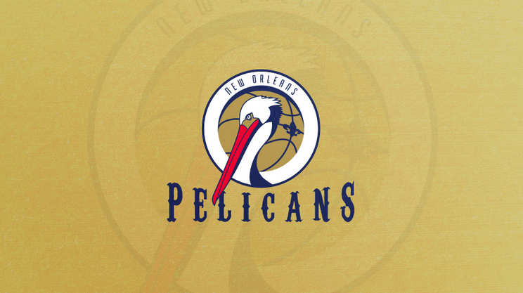
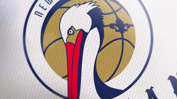
New Orleans Pelicans
Pelicans…are not all that scary or fierce, but I did my best to portray a strong and determined bird while using a fleur de lis and type that represents the city of New Orleans.
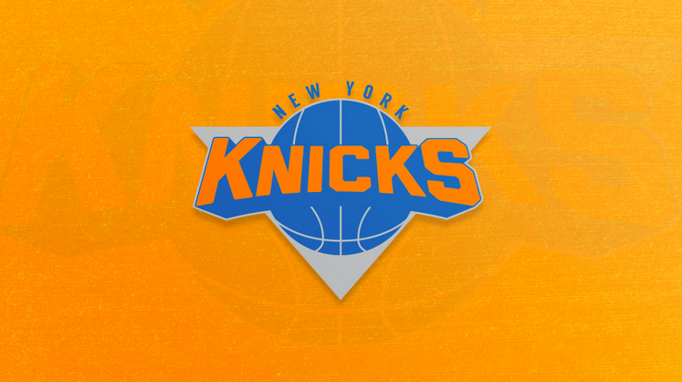
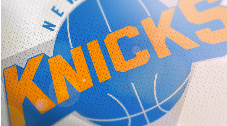
New York Knicks
I took bits and pieces from their current and one of their previous logos. I stuck with the 3D type, ball, triangular shape and pieced it all together and this was the result.
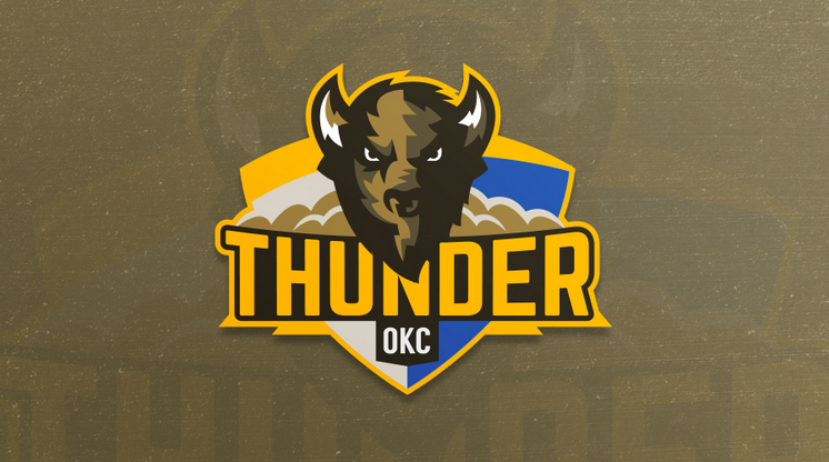
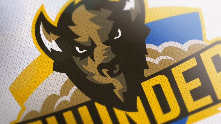
Oklahoma City Thunder
OKC’s mascot is a bison, so I created a tough looking bison and kept the shape of the shield from their current logo as the background. The shapes and lines throughout the logo depict lightning striking. I also removed the orange from their color scheme and added browns which I found more fitting.
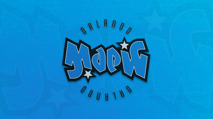
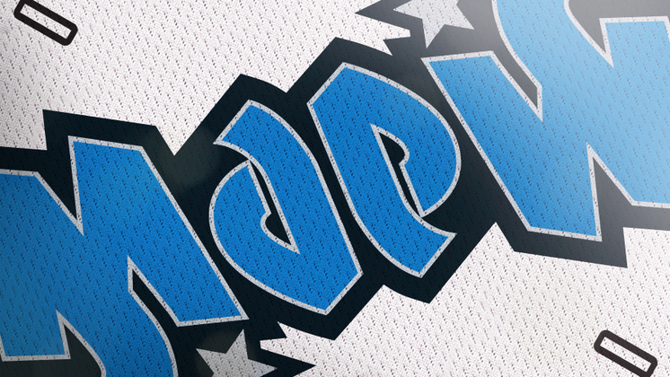
Orlando Magic
I remember looking at the DVD cover of one my favorite movies “The Princess Bride”. I noticed that if you turned the cover upside-down, the text would read the exact same! I thought it was magic! I wanted to try something similar with the Orlando Magic logo. There is no difference between this logo being upside-down or right-side up.
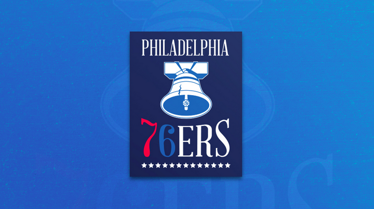
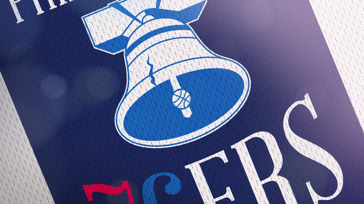
Philadelphia 76ers
I used the liberty bell to represent the city of Philadelphia and kept parts of their previous logos such as the 13 stars.
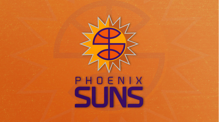
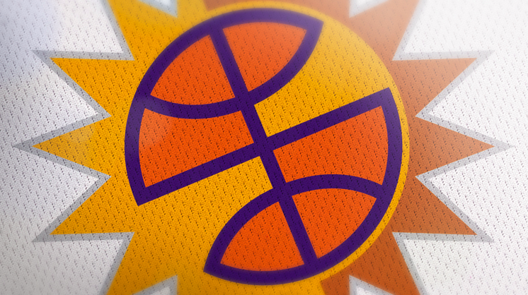
Phoenix Suns
I took the shape of a basketball and removed two sections to create an “S” for Suns which could easily be used as a secondary mark.
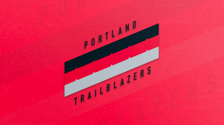
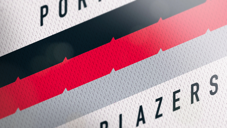
Portland Trailblazers
I based this logo off of the classic Blazers uniforms with the stripes running diagonally accross the front. Portland is called “The City of Roses”, so I added rose thorns to the stripes to represent the city of Portland.
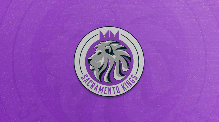
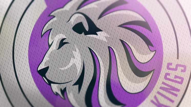
Sacramento Kings
Lions are the king of the jungle. The Kings mascot is also a lion, so it was an easy choice to use a lion as their symbol. If you look closely at the crown, I used basketball lines to shape it.
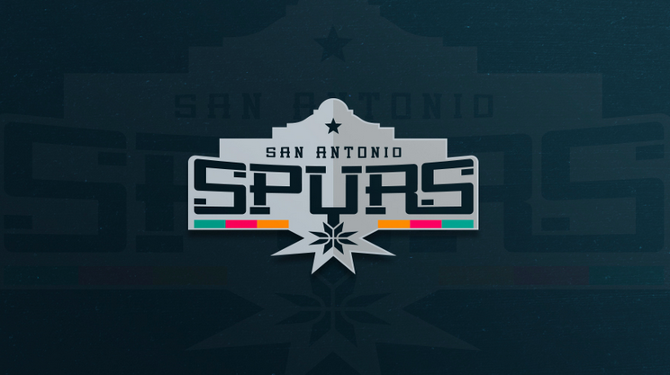
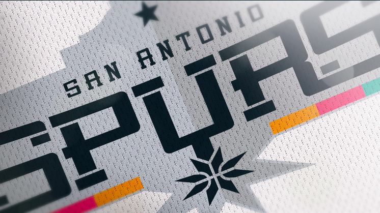
San Antonio Spurs
With this logo I wanted to use something that represented the city of San Antonio, so I used the Alamo to enclose the type. I made the spur at the base resemble a basketball and I even brought back a hint of their old colors to go with it.
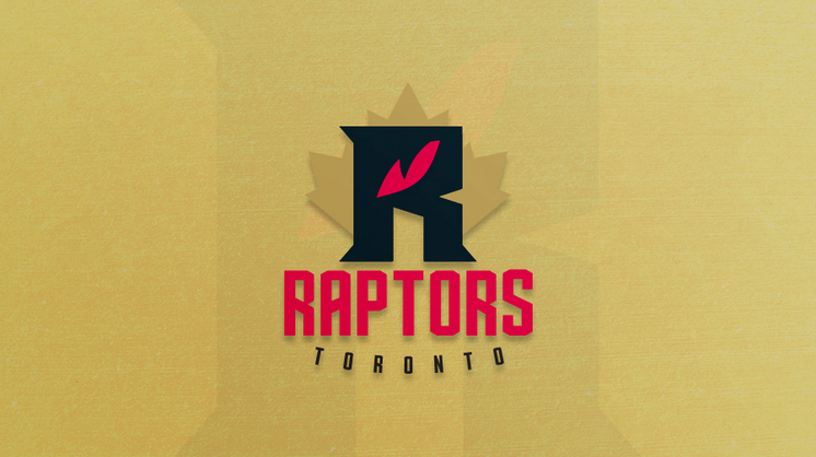
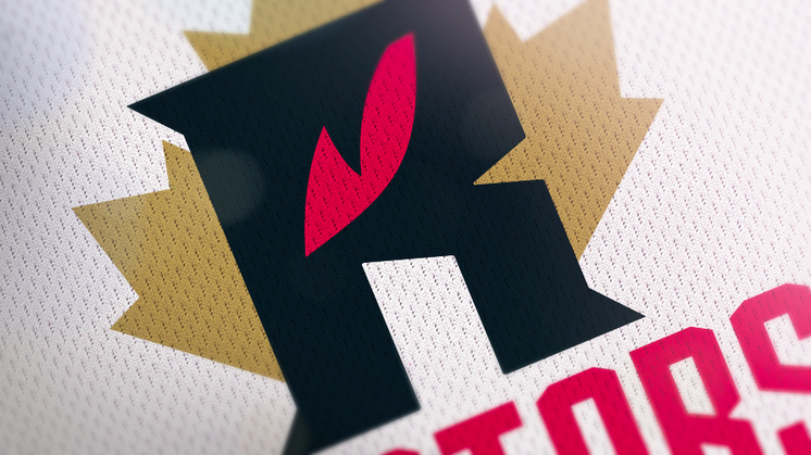
Toronto Raptors
This one was tough. I wanted to do something different, but I felt like all of the good ideas had been taken with all of the Raptors primary and secondary logos. I didn’t want to use a claw or show a whole raptor, so I ended up using a raptor’s eye as the focal point in the “R” and then placed a maple leaf behind it to represent Canada as the Raptors are the only Canadian and non U.S. team.
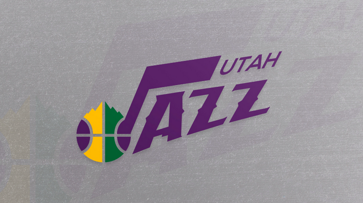
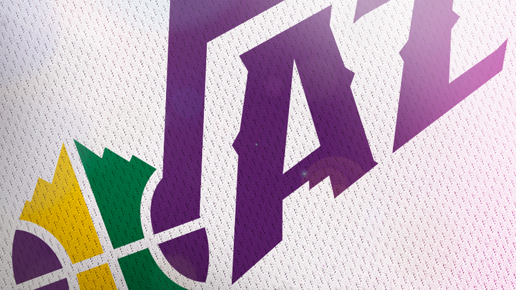
Utah Jazz
I wanted to try and completely blend two logos together. I mixed their mountain logo and the classic music note logo to create this. I even used negative space in the aperture of the “A” to showcase the shape of the state of Utah.
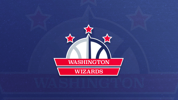
Washington Wizards
I based this design off of Washington D.C.’s flag which is two red stripes and 3 stars. I used the Washington Monument as one of the basketball lines like in their current logo.