The Utah Jazz are undergoing a makeover this summer. The team revealed a new court design as well as new uniforms and logos on Thursday. The designs are a nod to past Jazz designs with very few changes to what the team has used over the past few years.
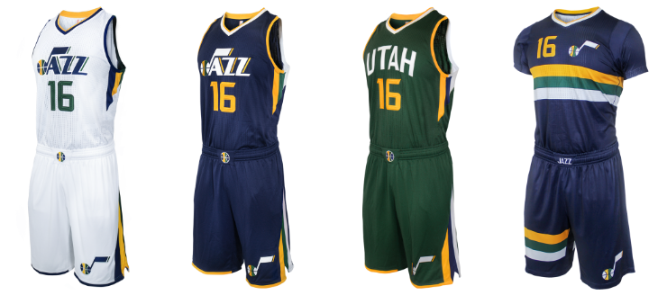
The team’s changes will be most noticeable on a set of four new uniforms. The home, road, and alternate road jerseys all look fairly similar to recent Jazz uniforms with just a few changes. The team is introducing a new “Pride” jersey, however, which is the sleeved jerseys shown above which look very much like soccer uniforms but do pay homage to throwback Jazz warm-ups.
Along with the uniforms come some new logo modifications, including adding “Utah” to the primary logo and adding a new tri-colored ball.

Finally, Utah will be playing on a newly-designed court next year, featuring the tri-colored ball as the center-court emblem and the musical note “J” on both ends of the floor.

I absolutely love the new court design. The tri-colored ball looks awesome at center-court and I’m a sucker for that musical note-basketball hybrid logo that the Jazz have used for so long.
As far as the uniforms go, I’m not crazy about them, but they certainly look nice. The home and road jerseys, especially, look professional but with the right amount of color to make them interesting. I could do without the sleeved jersey but the historical homage makes them at least decent.
This is a great way for the Jazz to re-brand. They keep pieces from their historic past in place while making them just modern enough to look at a bright future with a young, up-and-coming roster ready to take the next step.